Improving an Existing User Experience
Identfying and designing a solution for a user experience problem within an existing product and design system.

Purpose of this project
This project was a case study that I undertook in order to improve an existing interface at GetYourGuide. The main challenge was designing flexible-enough components and finding the right balance in displaying information.
My role
I managed the design process for this, all the way from identifying the opportunity to designing the new screens, and recieved feedback from product desingers at GetYourGuide.
Impact
A responsive desktop design with improved UX
Context
GetYourGuide is a marketplace for travelers to find, book and enjoy travel experiences. For our experience suppliers, creating a product in our marketplace is a core use case, and nearly 50,000 suppliers have created a product for travelers to discover and book.
For our suppliers, their time is limited because many are small or self-owned businesses, and managing products in GetYourGuide is just one of many things they need to do grow their business.
Due to differences across category and a need for information density the product creation flow has grown in complexity. This case study addresses a sub-segment of the flow to improve existing screen patterns.
Problem Discovery
The first step was to review the current flow for existing patterns and problem areas. I completed the flow multiple times in a test envinroment to get a detailed understanding of the experience. The area of focus was the following pages:
UX Audit

There were several key areas to improve:
Modal windows
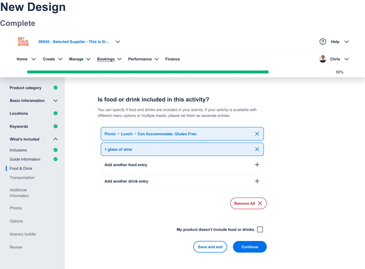
Several of the pages used unnesscary modals to prompt user input. These modals are more disruptive than helpful. New pages should have forms embedded in the page to avoid disrupting users.
Free Text Input
The inclusions page asks users to write the information in long-form content. This can prove to be taxing for the user and results in inconsistent information for customers. The new page should use strucutred content as the input format.
Decline Options
Several pages have the option to decline adding information when it does not apply. However, these are inconsistent and framed in a way that is confounding to the user. New pages should have a consistent approach and ensure that the choice is clear.
Designs

Original Design

New Design - Default

New Design - Active

New Design - Complete

Original Design

New Design

New Design

New Design