Complete Mobile App Prototype
Using Figma to create a complete prototype of a Spotify-like music app, with a focus on video.
About this project
This project was a case study that I undertook as part of Memorisely's UI Design Bootcamp. Our main challenge was designing responsive components and building a product that stood out while maintaining patterns expected by users.
My role
I was one of two designers collaborating on this project. Throughout this project I was received great feedback and guidance from my bootcamp instructors.
Impact
A responsive mobile and desktop application design and working prototype.
Benchmarking
Before designing anything we reviewed several apps in detail to understand competitors’ information archeitecture and best practicied interface patterns. We grouped these apps into direct competitors and indrect competitors.
We formed several key insights:
Very Strong Best Practices - the music player app market is dominated by a few key players (looking at you Spotify and Apple Music) that frame most patterns. We knew that users would expect these patterns and we would need a strong reasoning for any deviation.
Overcrowded Content - In many of these mature apps we realized that the content had become bloated, masking the core flow of finding relevant artists. We wanted to provide a streamlined user flow and maintain a clear IA.
Space for Video - The primary apps offer video as a secondary feature, and we saw space for Mahaogany's rich video content library as a point of differientation.

User Flows
For this project we decided to focus on the user task of browsing and playing an album or video as it's core to the service of Mahaogany.

Wireframes
We iterated several times on wireframes, starting at a very low fidelity and building up until we had wireframes that were robust and ready for the design phase.


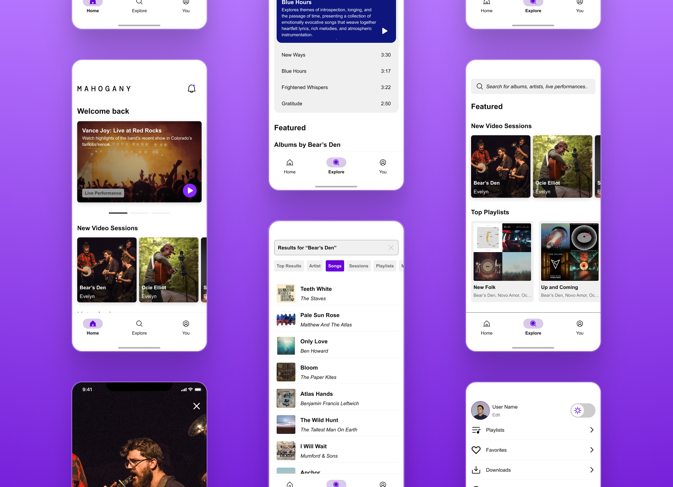
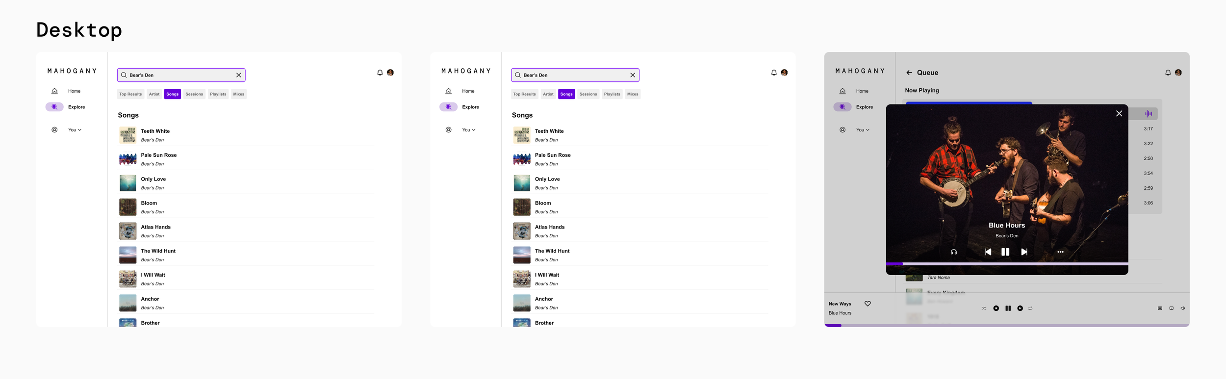
Final Designs
Our final designs ensure we showcased video and live experiences as primary content, focused on simple user flows, and included personalization features like light/dark mode and animation for personality.


Prototype
We wrapped these final screen designs in a Figma prototype focusing on the user flow of discovering music or video content.
Learnings
Continually come back to the problem statement or design brief.
We realized mid-way through that we were drifting from the original intent of the project and needed to course correct. This resulted in some lost time/effort but ensured that we provided a final design on-brief
Design compontents as responsive-and-content first for multiple formats.
Our challenge required a mobile and desktop format for the application. We focused our effort on the mobile format, but found that our components weren't always suited for desktop. This required some trial-and-error to get right, but we found a way forward and still maintained the overall look and feel of the design.
When designing with others, feedback is a two-way street.
It's very easy to give feedback, but much harder to recieve it. This was a first experience of needing to “kill my darlings” and do what's good for the team and end goal rather than hold tightly to a design choice.